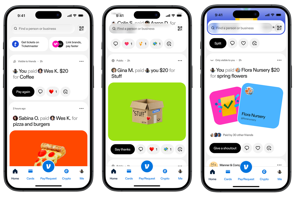
Venmo UX has always been different from traditional financial apps. It made money feel social, casual, and emotionally connected. But Venmo’s new app redesign shows a deeper product shift: the brand is moving from a simple peer-to-peer payment app into a broader money movement experience built around privacy, clarity, rewards, and modern financial behavior.
When Venmo first became popular, the product felt fresh because it removed the seriousness from sending money. Instead of looking like a bank, Venmo felt like a social feed. Users could split dinner, pay rent, send inside jokes, add emojis, and see activity from friends.
That was the original magic of Venmo UX. It transformed a cold financial action into a lightweight social interaction.
But user behavior has changed. Financial apps are no longer just places to complete transactions. They are now expected to manage identity, privacy, trust, rewards, spending, subscriptions, purchases, and everyday money movement.
Venmo’s redesign is important because it recognizes that the old experience could not support the new product reality forever.
The original Venmo UX was built on social proof
The first version of Venmo became successful because it understood something simple: people do not only exchange money, they exchange meaning.
A payment for coffee, dinner, rent, concert tickets, or a weekend trip is not only a transaction. It is also a social moment. Venmo turned those moments into visible activity.
From a UX perspective, this was powerful because it created trust through familiarity. Seeing friends use the app made the product feel normal. Seeing transaction notes made the app feel alive. The social feed helped Venmo grow because every interaction quietly reinforced the product’s place in daily life.
Why Venmo had to rethink the experience
Venmo is no longer just an app for paying a friend back after dinner. It now supports a broader financial ecosystem, including shopping, rewards, cards, crypto, business payments, scheduled payments, and money management features.
That creates a classic UX challenge. When a product grows, the original navigation model can become too small for the new experience.
The old Venmo interface was built around social payments. The new Venmo UX has to support a much wider set of user intentions. Sometimes a user wants to send money. Sometimes they want to check a balance. Sometimes they want to find rewards. Sometimes they want to manage privacy. Sometimes they want to use Venmo as part of a larger financial routine.
The redesign responds to that complexity by organizing the app around clearer behavioral zones instead of one dominant social feed.
The new navigation is built around intent
One of the biggest UX changes is the new structure around areas like Send, Money, and Rewards. This matters because it gives users a clearer mental model.
Instead of asking users to understand Venmo as one feed with many hidden features, the app now separates major actions into simpler categories.
Sending, requesting, splitting, groups, and scheduled payments belong close to the core action users already understand.
Balances, crypto, cards, and financial tools need a calmer, more organized space than a social feed.
Cash back, offers, and merchant discovery give Venmo a stronger role in everyday spending behavior.
The most important Venmo UX change is privacy
The biggest design shift may not be visual at all. Venmo is changing the default visibility for new users from public to friends only.
That is a major product decision because defaults are one of the most powerful forces in UX. Most users do not deeply customize settings. They accept what the interface suggests as normal.
For years, Venmo’s public feed helped the product grow. But in 2026, financial privacy carries more emotional weight. Users are more aware of what they share, who can see it, and how digital traces can expose personal relationships, habits, and routines.
By making friends-only visibility the default for new users, Venmo is shifting from growth-through-visibility to trust-through-control.
The new Venmo UX shows that modern fintech design cannot rely only on engagement. It has to earn trust before it asks for attention.
Privacy settings are becoming part of the user experience
In older digital products, privacy often lived deep inside settings. That made privacy feel like a technical preference instead of a core part of the experience.
Modern UX is different. Privacy has to be visible, understandable, and available at the moment users make decisions.
Venmo’s updated onboarding and transaction visibility controls show a stronger understanding of this principle. Users should not have to search for basic control over who sees their payment activity. The interface should make that control easier to understand from the beginning.
This is especially important because Venmo sits between two sensitive worlds: money and social identity.
The redesign keeps Venmo social, but with more control
Venmo is not removing its personality. That would be a mistake. The social layer is still one of the product’s strongest differentiators.
The smarter move is not to delete the social experience, but to make it more intentional.
Users can still interact, react, share, and create lightweight social moments. But the redesigned Venmo UX suggests a more mature product philosophy: social interaction should feel optional, not forced.
Social visibility helped the product feel active, fun, and culturally relevant.
Social features remain, but privacy and navigation are treated as core trust signals.
What designers can learn from Venmo UX
The lesson from this redesign is not simply “make the app cleaner.” The real lesson is to redesign around the user’s current mental model, not the product’s original identity.
Venmo started as a social payment app. But users now need it to behave like a trusted money movement platform.
That requires a different UX strategy. The interface has to reduce cognitive load, make privacy easier, clarify navigation, and help users understand where each financial action belongs.
What the Venmo redesign really tells us
The new Venmo UX is more than a redesign. It is a repositioning of the product.
Venmo is moving from a social payment feed into a broader money movement platform for a generation that expects both convenience and control.
The redesign works because it does not abandon what made Venmo recognizable. It keeps the social energy, but places it inside a more mature structure built around privacy, clarity, and financial utility.
For UX designers, this is the most important takeaway: when a product grows, the interface has to grow with it. The best redesigns do not just change how a product looks. They change how clearly users understand what the product has become.
The future of fintech UX will belong to products that feel emotionally intelligent, not just technologically efficient.