New Netflix mobile UX is one of the smartest product redesigns in streaming today. More than a visual update, it reflects a deeper understanding of human behavior, attention patterns, and mobile-first decision-making. Through vertical discovery, emotional sampling, and lower-friction navigation, Netflix is redefining how users find what to watch.
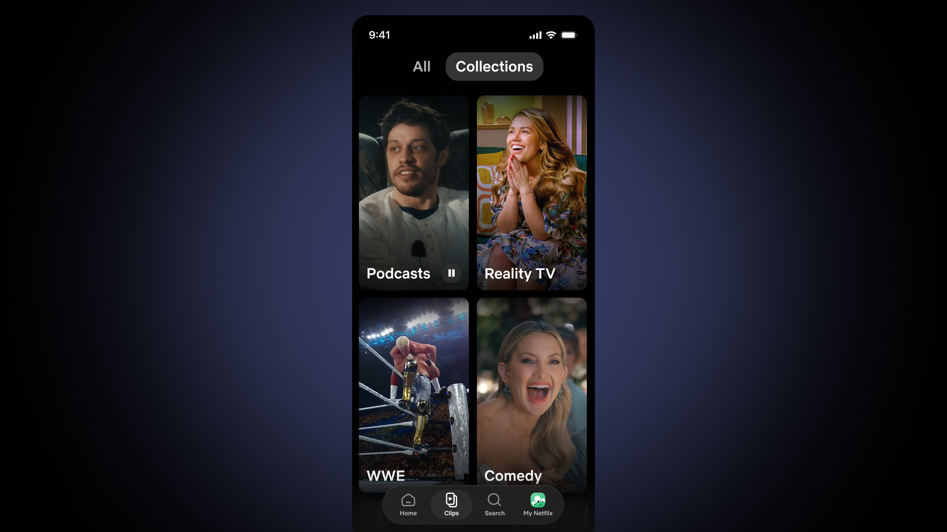
When Netflix introduced its new mobile interface, many people focused on the obvious part first: the vertical feed.
The comparison was immediate. It looks like TikTok. It feels like Reels. It borrows from short-form behavior.
But that reaction is too simple.
What Netflix is doing is much more interesting from a UX perspective. The company is not just copying a social media pattern. It is adapting mobile streaming to the way people already use their phones: quickly, visually, emotionally, and often in small moments between other tasks.
Netflix’s official announcement describes Clips as a vertical video feed designed for quick, visual discovery, helping users decide what to watch or play next without endless browsing. That language matters because it shows the real UX problem Netflix is solving: not content availability, but decision friction.
The old streaming model expected users to know what they wanted
Traditional streaming interfaces were built around active intent.
Open the app. Browse rows. Compare thumbnails. Read descriptions. Search by title. Choose something.
That model works when users arrive with time and intention. But mobile behavior is different. People often open apps while waiting, commuting, lying in bed, taking a break, or filling small empty moments.
In those moments, users may not know what they want yet.
Netflix’s new mobile UX recognizes this. Instead of asking users to make a decision first, it gives them a lightweight emotional sample.
Vertical discovery works because the interaction cost is almost zero
A vertical feed is powerful because it removes repeated decision points.
The user does not need to open a detail page, return to the previous screen, scan another row, or decide which category deserves attention.
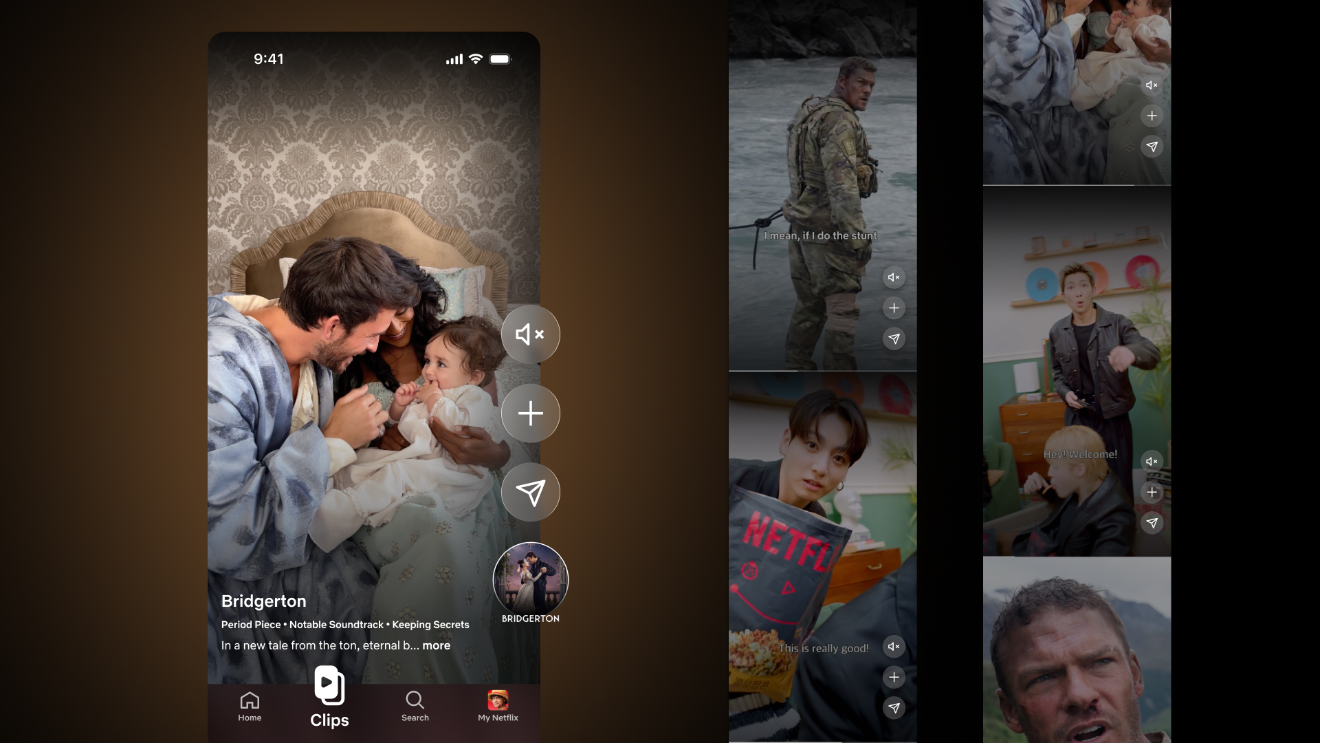
The next option arrives through one simple movement: swipe.
This connects directly to Fitts’s Law, one of the most important principles in human-computer interaction. Fitts’s Law explains that the time required to reach a target depends on distance and target size. On mobile, repeated vertical swiping is a low-effort gesture because it requires minimal precision and supports continuous motion.
In plain language: the thumb becomes the interface.
That is what makes the new Netflix mobile UX feel so natural. The action is physically easy, the reward is immediate, and the user does not have to think too hard before continuing.
Netflix’s vertical mobile feed turns content discovery into a faster, more visual, and lower-friction interaction.
The redesign reduces cognitive load without reducing the catalog
Streaming platforms have a classic UX problem: abundance can become friction.
More rows, more genres, more recommendations, more thumbnails, more categories. Technically, that gives users more choice. Psychologically, it can make choosing harder.
Hick’s Law explains why. As the number of choices increases, decision time increases too. Users may still enjoy having options, but the interface must help them move through those options without feeling stuck.
Netflix’s vertical feed does not remove the catalog. It changes how users enter it.
Instead of asking users to interpret a title or thumbnail, Netflix gives them a real moment from the content.
Curiosity, humor, suspense, recognition, or surprise becomes the first decision layer.
Netflix turns passive discovery into a clear next step without forcing a full commitment too early.
This is information scent, redesigned for entertainment
Nielsen Norman Group describes information scent as the cues users rely on to decide where to go next. When users believe a path will lead to value, they are more likely to continue.
In older interfaces, information scent often came from labels, thumbnails, navigation categories, or snippets of text.
In the new Netflix mobile experience, the scent is emotional and cinematic.
A clip can communicate tone faster than a description. A scene can reveal chemistry faster than a title card. A joke can sell a comedy better than a genre label.
That is why this redesign is so smart.
Netflix is not only making content easier to find. It is making content easier to feel.
Netflix understands that on mobile, emotion is often the fastest path to decision-making.
Why this is different from TikTok
It is easy to say Netflix is copying TikTok. But from a product strategy perspective, the goals are different.
Optimized for continuous consumption, creator discovery, and endless attention loops.
Optimized for sampling, saving, sharing, and moving users toward longer-form viewing.
This distinction matters.
Netflix is using a familiar interaction pattern, but the business and UX outcome is different. The goal is not simply to keep users scrolling forever. The goal is to help users find something worth watching faster.
That makes the new mobile experience less like imitation and more like intelligent adaptation.
What designers can learn from the new Netflix mobile UX
The lesson is not “add a vertical feed.”
The real lesson is to understand the behavior behind the pattern.
The bigger shift in UX
The best digital products today are no longer designed only around features. They are designed around behavior.
Netflix’s new mobile experience is a strong example of that shift.
The company understood that users do not always open a streaming app ready to search. Sometimes they open it ready to react.
The vertical feed turns reaction into discovery.
Discovery becomes interest.
Interest becomes commitment.
That is the product intelligence behind the redesign.
Great UX does not force users into an old behavior model. It studies how people already behave, then makes the product feel natural inside that reality.
Final thought
Netflix’s new mobile UX deserves more credit than a simple “TikTok-style” comparison.
It is a thoughtful behavioral design move that reduces cognitive load, improves discovery, supports mobile ergonomics, and gives users a faster emotional path into content.
For product designers, this is the real takeaway: modern UX is not about adding more choices. It is about helping users make better decisions with less effort.
Netflix understood that. And the new mobile experience shows it.