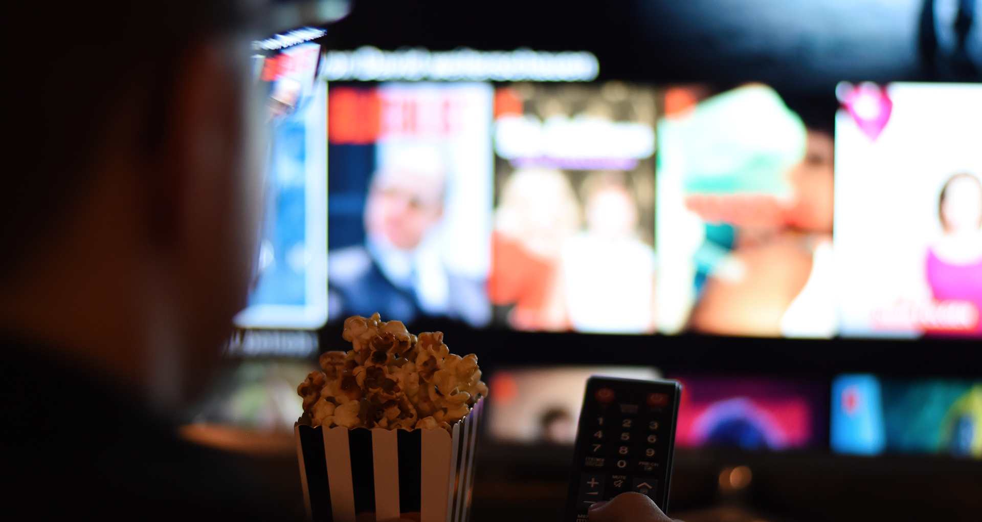
The future of search in digital products is not about matching words faster. It is about getting closer to what a person actually means. That is why Netflix search is such an interesting example for UX designers. What looks simple on the surface is built on a deeper shift, from retrieving content to interpreting intent.
For years, search experiences were built around keywords, filters, and exact matches. Users had to adapt to the system. If they used the wrong word, remembered the wrong title, or described something in a loose way, the experience often broke down.
That model no longer holds up in products with large libraries, personalized recommendations, and layered content relationships. Search starts to become less about locating one item and more about helping people move through a space that is too large to navigate through labels alone.
Why Netflix search matters to UX designers
Netflix is a useful example because search there is not separate from the rest of the experience. It lives inside discovery, recommendations, memory, and personal taste. A person may open search thinking they need a title, but what they often need is help narrowing a feeling, a mood, or a half-formed idea.
That changes the design problem. The question is no longer only whether the system can find a matching phrase. The real question is whether it can respond well when the user does not know the exact words to use.
The best search experiences do not just return results, they reduce the distance between what a person means and what the product understands.
What knowledge graphs change
A knowledge graph structures information through relationships instead of isolated records. A film is not treated as one flat entry. It can connect to actors, directors, themes, tone, release period, viewing behavior, audience patterns, and many other signals that help create context.
That structure matters because people do not think in database fields. They think in associations. Something funny but smart. Something tense, but not too dark. Something futuristic, emotional, and easy to finish over a weekend. A rigid system struggles with this kind of request. A connected one can move through meaning.
Knowledge graph thinking: connect the idea behind the words to related content.
A simple way to picture it
One way to understand the shift is to look at the path from input to result. A person starts with a loose request. The system then interprets that request through relationships. What comes back is shaped not only by keywords, but by connected meaning.
AND themes IN (“future”,”technology”,”alternate reality”)
AND watchCommitment IN (“film”,”limited_series”)
AND pacing IN (“accessible”,”weekend-friendly”)
AND emotionalIntensity != “too heavy”
| Title | Format | Why it fits |
|---|---|---|
| Her | Film | Near-future setting, intimate emotional story, easy to finish in one sitting |
| Ex Machina | Film | Technology-driven premise, strong atmosphere, thoughtful emotional tension |
| Black Mirror | Series | Future-facing themes, emotionally charged ideas, easy to sample through individual episodes |
This is why the idea of a knowledge graph matters so much for product design. It helps explain how a system can move from loose human language to results that feel relevant without asking the user to think like a machine.
Netflix search is not only search
In products like Netflix, search is tied to discovery. A person may begin with one request and then adjust based on what they see. They refine, compare, notice patterns, and sometimes realize they wanted something slightly different all along.
That makes search feel less like a utility and more like part of the product’s guidance system. It helps people orient themselves inside a large content space. This is a very different design challenge from simply displaying matching entries in a list.
For UX designers, this is where the conversation becomes interesting. Once a product is built around relationships, search stops being just an input field and becomes part of how the system makes itself understandable.
People do not experience products as rows of data. They experience whether the product seems to understand their situation.
What this teaches us about modern UX
Many digital products are still designed mainly as sequences. One screen leads to the next, then the next. That logic still matters, but underneath those screens the product often behaves more like a network than a straight line.
Recommendations, pricing rules, eligibility, personalization, content relationships, and account states all depend on connected information. When the interface does not reflect that structure clearly, the experience can feel fragmented even when the visual design is polished.
This is why modern UX needs stronger systems thinking. It is not enough to decide what comes next in a flow. We also need to understand what this thing is connected to, what context matters in this moment, and what the product already knows that could make the path easier.
From screens to systems
This shift changes the kinds of questions designers ask. Instead of focusing only on steps and pages, we begin to think in terms of entities, states, and relationships.
A recommendation is not just a card. A plan is not just a pricing page. A title is not just a title. Each one sits inside a wider structure of context and meaning. When that structure is reflected well in the experience, the product feels easier to move through without needing more controls or more explanation.
It is about revealing the right relationship at the right time, so the product feels clear instead of crowded.
Why this matters now
Interfaces are becoming more conversational, but conversation alone does not solve complexity. A smooth surface is not enough if the structure underneath is shallow. What matters is whether the product can connect intent, context, and content in a way that makes sense.
That is why this way of thinking matters well beyond entertainment. It applies to commerce, finance, healthcare, enterprise tools, and any product where users are trying to make decisions inside a system that is larger than one screen.
Final thought
Netflix search points to something many products are moving toward, better alignment between what a person is trying to express and how the system is organized underneath.
When that alignment is there, the experience feels lighter. The product does not need to explain as much, because the response already feels closer to the user’s intent.
That is where design becomes especially valuable, not only in how a product looks, but in how clearly it turns complexity into something people can move through with ease.