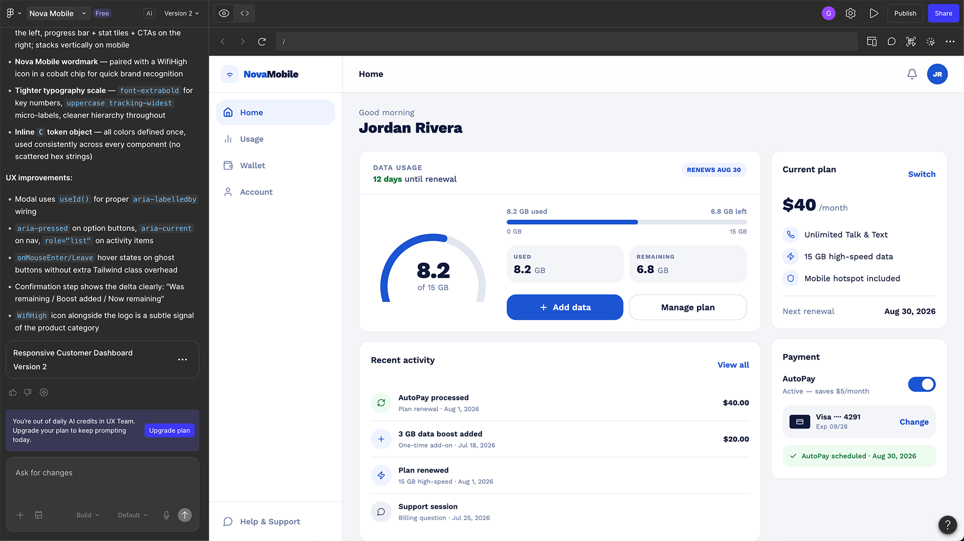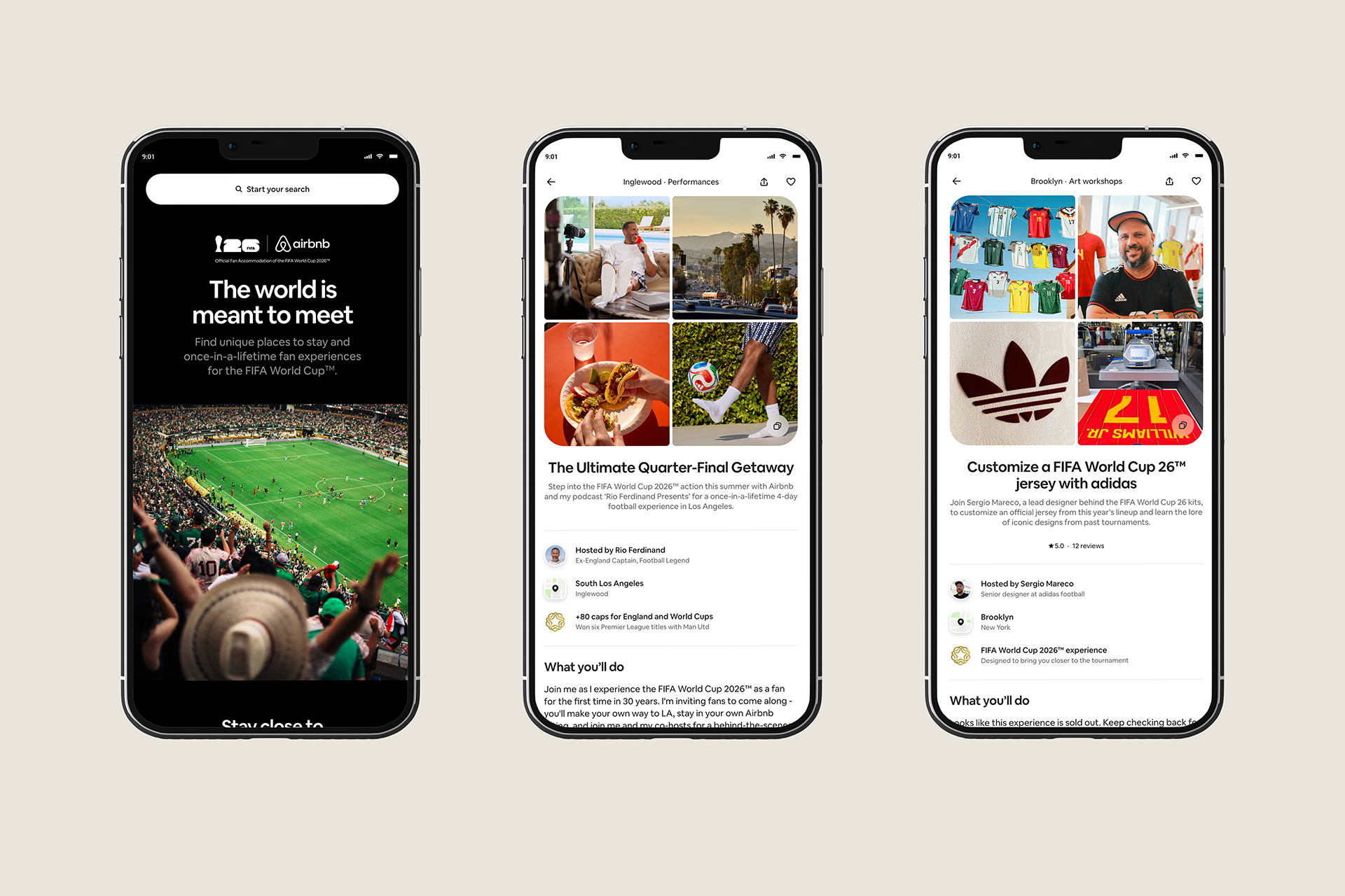
AI prototyping helps product teams turn an idea into an interactive experience they can examine, question, and test. The useful shift is how early that experience can enter a conversation—and how much teams can learn before committing to development.
A prototype makes an assumption visible. Can a merchant understand a new catalog workflow? Can a customer recover from an unavailable service? Does a new dashboard help someone make a decision? AI can shorten the path to exploring these questions, but generating an interface does not answer them.
Uber offers a useful example of this change. Alongside its experience, research and current tools give designers a practical way to start: define a learning goal, build several plausible directions, and evaluate behavior before polishing the preferred solution.
What Is AI Prototyping?
AI prototyping uses generative tools to create and revise representations of a product experience. The input might be a written brief, existing interface, component reference, or codebase. The output can range from a visual concept to an interactive flow with working forms, filters, navigation, and simulated data.
It helps to distinguish three levels. A visual prototype communicates layout and hierarchy. An interactive prototype lets people complete a sequence of actions. A functional prototype can demonstrate logic or integrations. Choose the lowest level that can answer your research question; more functionality also means more assumptions to review.
AI prototyping also differs from designing an AI-powered product. You can use AI to prototype a conventional booking form without adding AI to the final experience. The method describes how you build the prototype, not necessarily what the product does.
What Uber’s Approach Shows
In its article on AI prototyping, Uber describes using tools including Lovable, Figma Make, Claude Code, and Cursor to explore interactive flows earlier in product development.
One merchant-team example involved adapting a prototype to a merchant’s catalog. Uber reports that two hours of prototyping helped resolve a discussion that had continued for four weeks. Another team explored six concepts in around 20 minutes. These are company-reported examples, rather than controlled measurements of universal productivity gains.
Uber groups the benefits into broader exploration, faster alignment, and unblocked execution. It also explains that prototypes complement requirements documents: the interactive artifact helps reveal questions, while written requirements retain intent, constraints, and decisions.
For designers, the interesting lesson is how the prototype changes the conversation. A written proposal leaves room for different interpretations. An interactive flow gives collaborators something specific to question: the order of steps, the information shown, and the consequences of an action.
A useful prototype gives the team a question it can investigate—not just a screen it can admire.
What Research Adds
A research preprint on AI-assisted design examined prompt-to-design workflows with 50 product designers and 50 product managers. Among participants who completed the study tasks, access to Figma Make was associated with approximately 20% shorter completion times. Product managers showed larger gains, while benefits for professional designers depended on the task.
The scope matters. This was a study of standardized design tasks, not a measurement of an entire product launch. Faster completion does not by itself demonstrate better usability, stronger accessibility, or improved business outcomes. The practical takeaway is to measure both production time and the quality of learning that follows.
AI Prototyping Tools: Choose by the Question
The following selection guidance is an editorial assessment based on official product pages and documentation. Tools overlap, and access, credits, and features can vary by plan. Start with the kind of work you need to evaluate rather than choosing a platform solely because it produces an attractive first screen.
Affiliate disclosure: I may earn a commission if you purchase through the Lovable link below.
| Tool | Useful starting point | What to review |
|---|---|---|
| Figma Make | Interactive exploration supported by design context. Make kits provide a way to bring packages, styles, and guidelines into prototypes. | Check component behavior, token use, and consistency with the intended design system. |
| Lovable | Discussing an app change before generating implementation. Plan mode investigates the project and produces a reviewable plan before code changes. | Keep the exercise small and make simulated functionality explicit. |
| v0 | Iterating on a web interface. Design mode provides visual editing controls and a live preview. | Review responsive behavior and real interaction states alongside appearance. |
| Cursor | Exploring behavior in a codebase with engineering participation. Agent can edit code, run commands, and use browser tools to test changes. | Review dependencies and code changes; automated checks do not establish usability. |
If you already have a design system, start by providing its components, spacing, typography, and interaction rules. If you are exploring an unfamiliar problem, begin with a short flow and fictional data. Connecting databases or payment services rarely helps answer an early navigation question.
A Practical AI Prototyping Workflow
1. Define one learning goal
Replace “build a booking app” with “find out whether customers understand how to choose a service and request an available time.” Identify the intended user, the task, the uncertain assumption, and the evidence you need. That brief becomes the standard against which you evaluate the generated result.
2. Describe behavior before styling
List the main steps and what happens between them. Specify whether a selection updates a summary, whether the user can go back without losing information, and what happens when an option becomes unavailable. Then add visual references and design-system constraints. Attractive defaults can otherwise conceal missing behavior.
3. Compare different approaches
Generate alternatives with different interaction structures: a guided sequence, a single-page form, and a comparison-first layout, for example. Changing the accent color does not test a different product idea. Compare how each approach supports the same task and how much information users must remember.
4. Build the recovery path
Add an empty state, invalid input, a loading state, and a failed submission. Ask the tool to preserve completed fields after an error. A prototype that only succeeds cannot reveal whether users understand how to recover when the service fails.
5. Test with people
Give participants a realistic task without explaining the interface. Observe where they hesitate, what they expect, and whether they understand the outcome. Ask neutral questions such as “What do you think happens next?” Record completion, assistance required, recovery success, and misunderstandings about whether an action was real.
6. Record the decision
After each round, document what changed, which observation supported the change, and what remains uncertain. Keep a stable version for each testing session. Otherwise, feedback from different participants can refer to different experiences and become difficult to compare.
My 15-Minute AI Prototyping Exercise
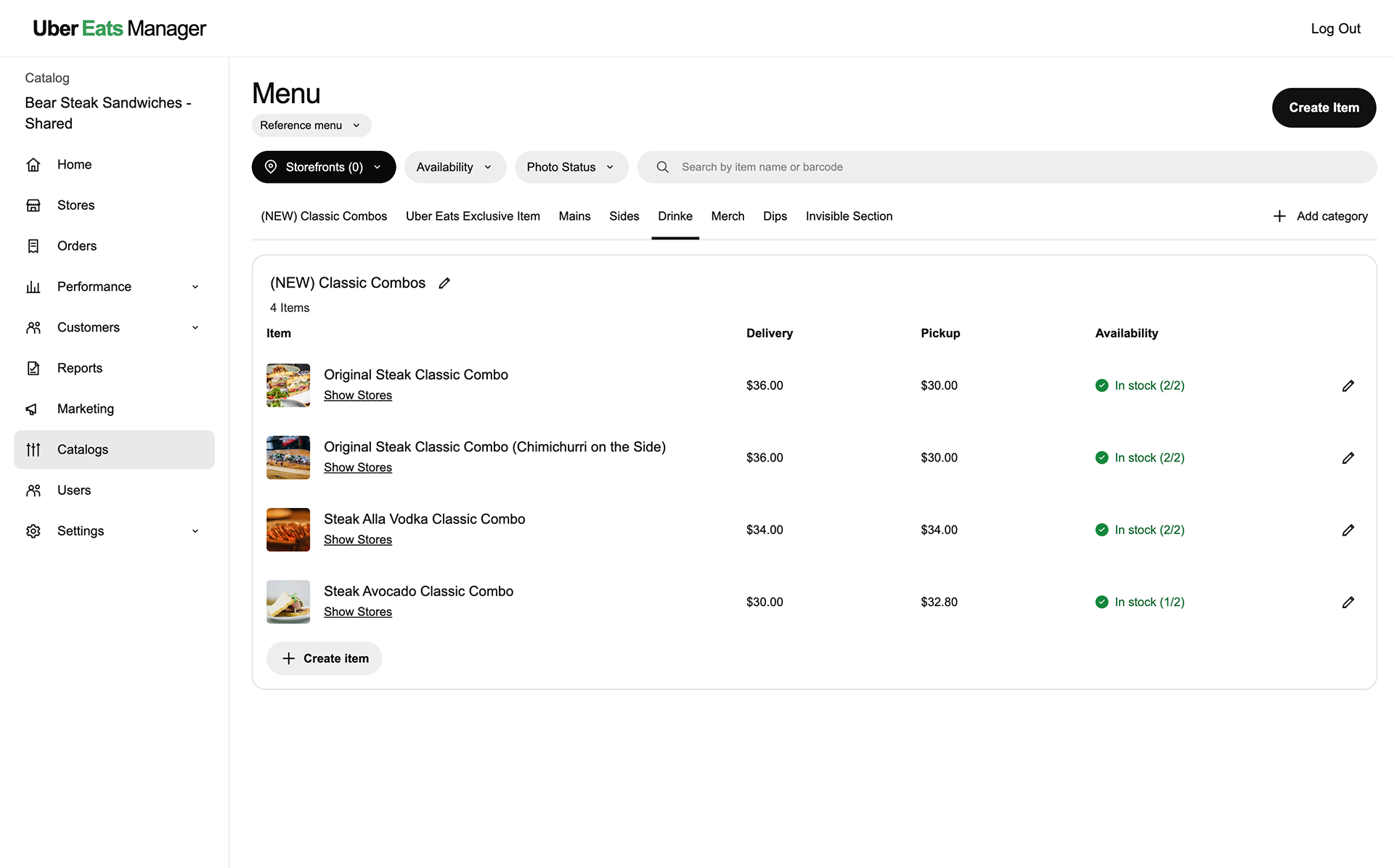
To explore this workflow myself, I recreated an Uber Eats Manager catalog reference in Figma Make in approximately 15 minutes. I used a screenshot to guide the layout and a structured prompt to describe the menu, filters, item rows, and intended interactions.
This is my independent educational recreation of the reference interface. It is not an official Uber prototype or work I created for Uber. The 15 minutes describes my recreation time; it does not include a full usability study or production validation.
Explore the prototype below, or open the interactive prototype in a new tab.
If the embedded prototype does not load, open it in a new tab.
The Figma Make Prompt for This Recreation
To try a similar exercise, attach the Uber Eats Manager reference screenshot in Figma Make and use the prompt below. These instructions describe the intended behavior; check the generated interactions against them before sharing your result.
Copyable prompt: catalog management prototypeRecreate the attached Uber Eats Manager catalog screen as a high-fidelity, interactive desktop prototype. Match the screenshot’s layout, spacing, typography, colors, and information density.

PURPOSE
Show how a restaurant manager browses a menu, checks availability across stores, and edits items. Use mock data for this educational recreation.

VISUAL DESIGN
White background, black text, subtle gray borders, clean sans-serif typography, outlined icons, green availability indicators, black primary buttons, and light-gray pill-shaped filters. Avoid decorative gradients and extra dashboard widgets.

APP SHELL
Use a 1440px desktop reference, a 64px header, a 240px left sidebar, and approximately 24px content padding.
Header: Uber Eats Manager on the left; Log Out on the right.
Sidebar heading: Catalog / Bear Steak Sandwiches - Shared.
Navigation: Home, Stores, Orders, Performance, Customers, Reports, Marketing, Catalogs, Users, Settings.
Highlight Catalogs with a light-gray rounded background.

MAIN CONTENT
Title: Menu.
Small Change menu dropdown below.
Black Create Item button at the upper right.

FILTERS
Storefronts (0), Availability, Photo Status, and a wide search field labeled “Search by item name or barcode”.

CATEGORY TABS
(NEW) Classic Combos, Uber Eats Exclusive Item, Mains, Sides, Drinke, Merch, Dips, Invisible Section.
Match the screenshot’s initial underline beneath Drinke.
Place + Add category at the far right.

CATALOG PANEL
White panel with a thin gray border and 16px corner radius.
Heading: [NEW] Classic Combos / 4 Items.
Include rename pencil and collapse chevron.
Columns: Item, Delivery, Pickup, Availability, Edit.

ROWS
Original Steak Classic Combo — $36.00 / $30.00 / In stock (2/2).
Original Steak Classic Combo (Chimichurri on the Side) — $36.00 / $30.00 / In stock (2/2).
Steak Alla Vodka Classic Combo — $34.00 / $34.00 / In stock (2/2).
Steak Avocado Classic Combo — $30.00 / $32.80 / In stock (1/2).

Each row has a small sandwich thumbnail, item name, underlined Show Stores link, green availability check, and edit pencil.
Add + Create item at the bottom left.

INTERACTIONS
- Search filters by item name or mock barcode.
- Availability: All, In stock, Partially available, Out of stock.
- Photo Status: All, With photo, Missing photo.
- Storefronts: two fictional stores with checkboxes and updated selection count.
- Category tabs switch content and active underline after interaction.
- Show Stores opens a per-store availability modal.
- Item pencil opens an edit drawer for name, description, prices, category, and availability.
- Save updates the row and shows a success message.
- Create Item adds an item and updates the category count.
- Add category opens a dialog and creates a tab.
- Category pencil renames; chevron collapses the rows.
- Change menu switches between two fictional menus.

QUALITY
Include validation, preserved inputs after errors, empty search results, and Clear filters.
Support keyboard access, visible focus, labeled fields, and Escape to close dialogs.
Use local state and reusable components.
Do not connect real accounts, payments, bookings, or Uber services.
Log Out only shows a demo message.
Keep desktop faithful to the screenshot; allow horizontal table scrolling on smaller screens.

Build the reference screen first, then add interactions without changing its visual character.
What I wanted to examine was how quickly a detailed reference could become something readers could explore. The next step is to test the resulting flow: do the filters make sense, can users edit an item without losing information, and do availability labels communicate the right meaning? Recreation speed is a useful starting measure; those observations determine the design’s usefulness.
A Prompt Readers Can Try
This fictional appointment example can be adapted to another industry. It focuses on a testable task and includes failure states instead of requesting an entire production application.
Starter prompt: appointment requestCreate an interactive mobile-first prototype for a fictional salon.

Learning goal:
Test whether a first-time customer understands how to select a service,
choose an available time, and submit an appointment request.

Before building:
Ask up to three questions about missing requirements.
Suggest two different flow structures and explain the tradeoffs.
Wait for me to select a direction.

Scope:
Use fictional services, prices, staff, and availability.
Include service selection, time selection, review, and confirmation.
Make clear that a request is not a confirmed appointment.
Do not connect payments, send messages, or create real bookings.

Behavior:
Preserve selections when navigating back.
Include no available times, invalid contact details, loading,
and a failed submission with a retry.
Allow the customer to edit choices before submitting.

Design:
Use the provided design tokens and reusable components.
Include visible labels, keyboard access, visible focus,
and readable error messages.
Support narrow mobile and desktop widths.

After building:
List assumptions, simulated actions, and unimplemented behavior.
Suggest five neutral usability-testing tasks.
Review the generated flow before testing it. If the tool invents cancellation policies, fees, or guarantees, replace those details with approved content or clearly labeled fictional information. A plausible sentence can change what participants believe the service promises.
Check Accessibility and Design-System Fit
Generated interfaces need the same accessibility review as manually built ones. Check keyboard navigation, focus order, form labels, error identification, contrast, zoom, and screen-reader announcements. Use WCAG 2.2 as a reference and combine automated checks with manual interaction testing.
Give the tool specific corrections: “Reuse the primary-button component and retain its focus style” is more actionable than “make it accessible.” Recheck the result after changes; a later styling revision can affect previously working interactions.
How to Measure Whether It Helps
Track time to the first testable flow, time spent correcting output, and time needed to reach a documented decision. Pair those measures with task completion, recovery success, and unresolved usability problems. Include generation costs and review time in the comparison.
A team that generates ten prototypes but learns nothing has increased output without improving direction. A team that builds two alternatives and discovers a confusing confirmation step has evidence it can use. The strongest measure is whether the prototyping process changed a product decision for a defensible reason.
Frequently Asked Questions
Do designers need to code for AI prototyping?
You can begin with conversational tools without writing code. Understanding components, state, responsive layouts, and data helps you evaluate the result. Engineering involvement becomes more useful as the prototype introduces technical dependencies or complex behavior.
Can an AI-generated prototype become the final product?
Potentially, but a working demonstration does not establish production readiness. The transition requires review of architecture, security, privacy, accessibility, performance, and real integrations. Treat that as a separate decision with explicit acceptance criteria.
Can AI replace usability testing?
AI can help draft tasks, suggest possible failure scenarios, and organize observations. Its predictions are hypotheses. Feedback from generated personas should not be presented as evidence of how actual customers behave.
What This Means for Product Designers
AI prototyping lowers the effort required to make an idea tangible. Designers can use that opportunity to compare interaction models, involve collaborators earlier, and investigate states that previously received too little attention.
The valuable skill is deciding what the prototype must help you learn. Start with one uncertain assumption, choose a tool that suits the exercise, and let observed behavior shape the next iteration. Faster generation becomes useful when it leads to better-supported decisions.
Sources and Further Learning
- Uber: AI Prototyping Is Changing How We Build Products at Uber — April 15, 2026
- Stewart et al.: Does AI Save Time on Product Design? — September 22, 2026 preprint
- Figma Make: features and learning resources
- Lovable: Plan mode documentation
- v0: Design mode documentation
- Cursor: Agent overview
- W3C: Web Content Accessibility Guidelines 2.2