Figma Make rapid prototyping changes how product designers move from UX briefs to working experiences. Instead of linking static frames to simulate a product, designers can describe an experience in natural language and generate a functional interface with responsive layouts, working interactions, and code. The speed is impressive. The more important question is what that speed changes for UX practice.
Figma Make is an AI-driven prompt-to-app workspace for creating functional prototypes, web apps, and interactive interfaces. Designers can begin with a written brief, attach Figma frames, components, images, or files, add design-system context, and generate a working preview.
The workspace combines AI chat with a live preview. Teams can iterate through prompts, select interface elements for direct visual editing, add in-context annotations, inspect generated code, share a preview, or publish the result to a dedicated URL. Some features, AI credits, and sharing options vary by plan and seat.
An interface can be functional before it is usable. Figma Make accelerates the build, but product designers still have to define the experience.
What Figma Make Can Do Now
Figma Make turns product intent into a code-backed experience that people can use. A team can provide a prompt alone or strengthen it with existing designs, components, library styles, Make kits, attachments, and web context. The tool uses that material to generate both the interface and its behavior.
The distinction between a clickable prototype and a functional prototype matters. A traditional Figma prototype is excellent for communicating flow, hierarchy, transitions, and intent. But complex behavior often has to be approximated across multiple frames. A functional prototype can respond to input, calculate values, manage states, display conditional content, and behave more like the eventual product.
Figma Make does not remove the need for Figma Design. The two tools answer different questions. Figma Design remains the place to explore layout, components, systems, flows, and visual decisions with precision. Figma Make helps teams test how those decisions behave when the interface becomes interactive.
From UX Brief to Functional Prototype
The quality of a Figma Make prototype depends heavily on the quality of its input. A strong UX brief defines the user, primary task, information hierarchy, expected journey, interface states, responsive behavior, accessibility requirements, and design-system constraints. That gives the model product direction instead of only visual inspiration.
The Properties panel makes precise visual refinement faster. Select Edit in the upper-right toolbar, choose an element, and adjust values such as layout, spacing, typography, color, borders, radius, and opacity. For behavior, Annotate for agent connects an instruction to the exact element it concerns. Proposed edits appear above the prompt field for review before they are applied. These controls are available in newly created Make files.
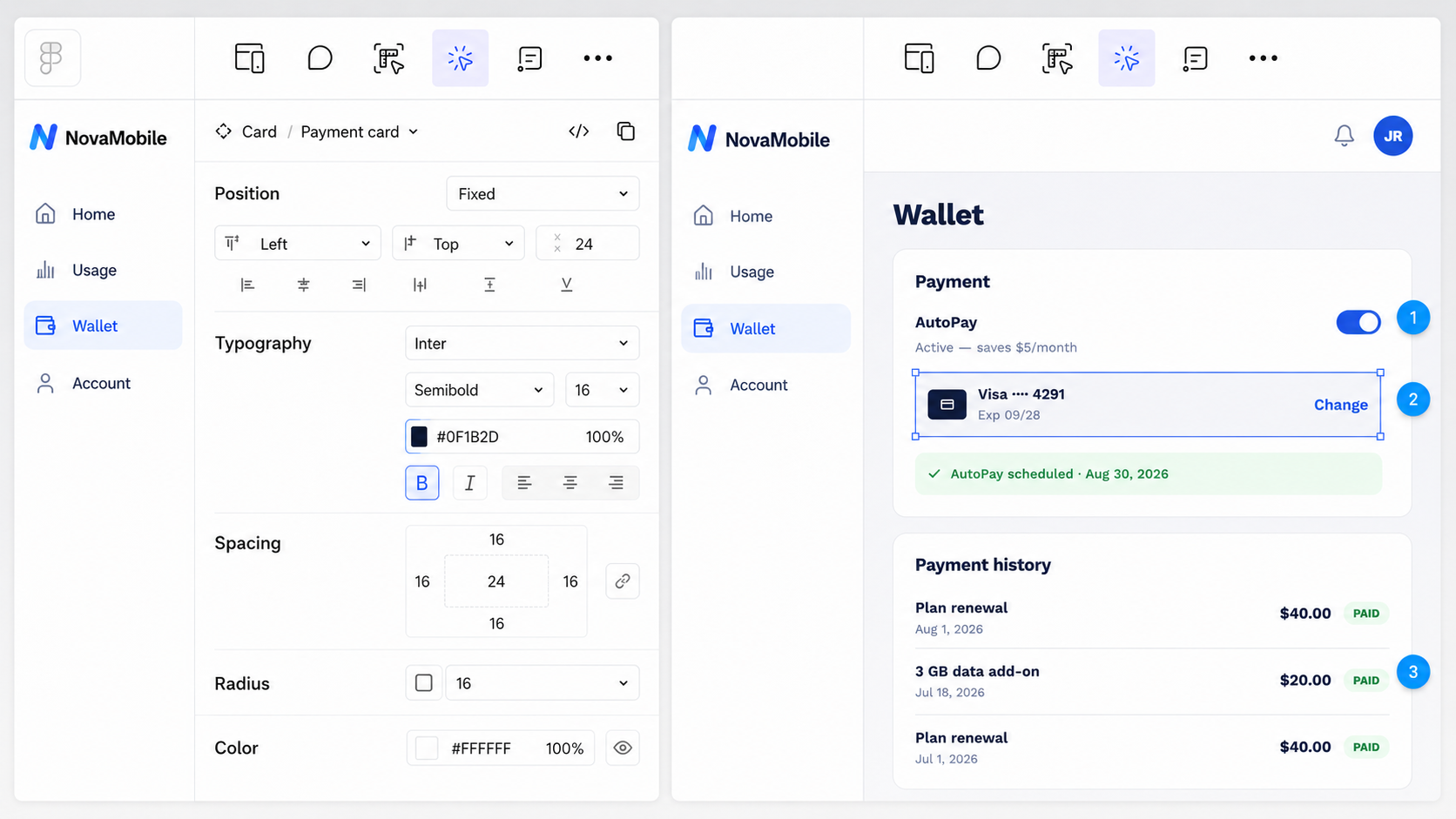
The Figma Make Properties panel supports precise visual editing, while annotations attach behavioral instructions to specific interface elements.
This combination is more useful than a chat box alone. Direct manipulation works best when a designer knows the exact value to change. Prompting is better for broader behavior or coordinated revisions. Annotations reduce ambiguity by showing the agent precisely where an instruction applies.
The most useful prototype is not the one that looks finished. It is the one that helps the team make a better decision.
My Figma Make UX Experiment
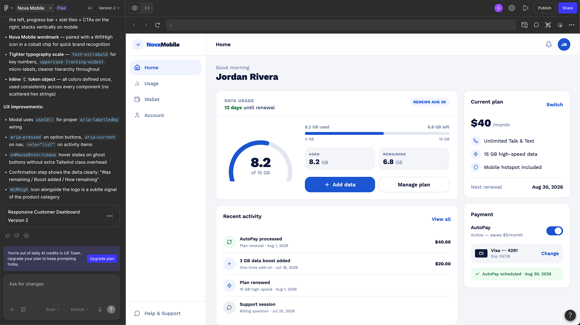
To evaluate Figma Make as a product-design tool, I created a focused test: a responsive account dashboard for a fictional prepaid wireless company called Nova Mobile.
The scenario is intentionally practical. A customer needs to check current data usage, understand when the plan renews, add more data, and manage payment settings. These are common account-management tasks where hierarchy, clarity, feedback, and accessibility matter more than visual novelty.
The goal is not to see whether Figma Make can produce an attractive dashboard. It is to test whether a detailed UX brief becomes a coherent, functional experience—and to identify what still requires product-design judgment.
Readers can also explore the published Nova Mobile prototype and test the Add Data journey directly.
Try the Live Prototype
If the prototype does not load here, open the Nova Mobile prototype in a new tab.
What Makes This a UX Prompt Instead of a Styling Prompt?
A weak prompt asks for a beautiful dashboard in a specific color palette. A stronger UX prompt explains who the user is, what they need to accomplish, what information matters most, how the interface should behave, and which constraints the experience must respect.
Visual direction is still useful, but it should support the task instead of becoming the task. “Use cobalt blue” is a styling instruction. “Make current data usage the most prominent information and place Add Data directly below it on mobile” is a product decision.
Good prompts describe user intent and product constraints, not only visual style.
How I Evaluated the Generated Prototype
A generated prototype should be reviewed with the same discipline as any other product proposal. The output may arrive faster, but the evaluation criteria do not disappear.
The first result established a clear hierarchy. Data usage occupies the largest card, renewal timing is easy to find, and Add Data receives the strongest action styling. Current plan and payment information remain visible in a secondary column without competing with the customer’s main task.
The interface also exposes the same usage status through a semicircular meter, separate Used and Remaining values, and a horizontal progress bar. The repetition makes the data difficult to miss, but it adds visual weight without adding new meaning. One clear visualization supported by exact text values would likely scan faster.
Why a Functional Prototype Changes the Feedback
Static screens often invite feedback about surface details: color, typography, spacing, and individual components. A functional prototype makes behavior visible. Stakeholders can experience the order of steps, the timing of feedback, the logic of a modal, and the relationship between an action and its result.
That can move a conversation from “I like this screen” to more useful questions:
This is where Figma Make can be valuable before engineering invests in a final implementation. A working model gives the team something concrete to test, challenge, and refine.
In the live prototype, the Add Data flow was more complete than a static screen could demonstrate. Continue remains disabled until the customer chooses a package. Each option shows its total price and price per gigabyte, while “Most popular” and “Best value” labels help customers compare. The review step repeats the data amount, masked payment method, availability timing, total cost, and refund limitation before confirmation.
The success state then confirms that 3 GB was added and calculates a new remaining balance of 9.8 GB. This sequence creates strong decision clarity: choose, review, confirm, and understand the result.
The Prototype’s Most Important UX Failure
The strongest lesson appeared after completing the purchase. The confirmation screen correctly said that the customer’s remaining data increased from 6.8 GB to 9.8 GB. But after selecting Done, the dashboard changed Used from 8.2 GB to 11.2 GB and reduced Remaining from 6.8 GB to 3.8 GB.
In other words, the interface treated the 3 GB purchase as data the customer had consumed rather than additional data they had purchased. The confirmation and dashboard displayed two incompatible versions of the same account state.
The expected logic is straightforward: used data should remain 8.2 GB, the total allowance should increase from 15 GB to 18 GB, and remaining data should become 9.8 GB. The latest purchase should also appear in Recent Activity. Neither update happened correctly.
This is exactly the kind of issue a functional prototype can reveal. Every individual screen looks plausible. The error appears only when the user completes the journey and the system has to preserve state across steps.
The prototype passed the visual test and failed the state-management test. That difference is why working behavior still needs product review and QA.
Figma Make and Design Systems
Design systems are one of the clearest tests of whether AI-assisted prototyping can work inside a real product organization. A fast prototype that ignores established components, tokens, content patterns, and accessibility rules can create more cleanup than progress.
Figma Make supports importing an existing Figma library so a prototype can begin with more of the team’s visual language. Newer workflows also use color and typography tokens defined in the connected codebase. Figma has said that deeper component consistency through Code Connect is coming to the Make editing experience, but teams should evaluate the capability that is available to them rather than assuming perfect parity.
Even with library context, the designer still needs to inspect how the system has been used. A component may be visually correct but placed in the wrong hierarchy. A success color may be tokenized but used decoratively. A modal may match the system while creating an unnecessary interruption.
Design-system compliance is not only using the right component. It is using the component for the right reason.
Accessibility Still Requires Human Review
Including accessibility requirements in the prompt is useful, but it is not proof of accessibility. A generated interface can claim to follow WCAG while still containing a confusing focus order, a silent status update, an inaccessible modal, or a progress indicator that depends entirely on color.
The Nova Mobile prototype needs more than compliant-looking colors. The Add Data flow should keep keyboard focus inside the modal while it is open, return focus to the initiating control when it closes, expose option names and prices to assistive technology, and announce confirmation or error messages at the correct time.
The data-usage visualization also needs a text equivalent. A customer should be able to understand “8.2 GB of 15 GB used, with 12 days remaining” without interpreting a ring, bar, or color change.
The generated prototype includes several promising semantic details: the navigation has an accessible name, the usage graphic is exposed as a progress bar with the value “8.2 of 15 GB used,” the package choices are grouped, the selected option reports a pressed state, and Continue is correctly disabled before selection.
However, keyboard testing exposed a major modal problem. When Add Data opened the dialog, focus remained on the Add Data button behind the overlay. Pressing Tab moved focus to Manage Plan—another control behind the modal—instead of moving into the dialog. The background remained keyboard-interactive, and the modal did not establish a contained focus sequence.
This is a useful reminder that accessible names and roles do not guarantee an accessible experience. A modal must move focus inside when it opens, keep keyboard navigation within the dialog, support a predictable close action, and return focus to the initiating control.
The Risk of an Impressive First Result
Generative tools are good at producing an interface that looks plausible. Plausibility can become a problem when visual completeness is mistaken for product readiness.
A dashboard can look polished while hiding weak assumptions. Perhaps users do not understand what “high-speed data” means after the allowance is used. Perhaps customers are more concerned about renewal cost than remaining days. Perhaps the Add Data action creates anxiety because the payment method is not shown until the last step. Those questions cannot be answered by visual quality.
The faster a prototype becomes convincing, the more deliberately the team must separate three things:
Faster output should create more room for evaluation—not a reason to skip it.
The Evidence-Based Figma Make Refinement Prompt
The first generation is only a starting point. After reviewing hierarchy, interaction behavior, and accessibility, the next prompt should be more targeted. It should preserve what works and clearly describe what needs to change.
This prompt is based on observed behavior rather than a vague request to “make it better.” It identifies the incorrect state transition, supplies the expected calculation, defines the missing keyboard behavior, and removes one source of visual redundancy while preserving the parts of the flow that already work.
Figma Make vs. Figma Design
Figma Make and Figma Design should not be treated as competing versions of the same tool. They support different parts of the product-development process.
A team may begin in Figma Design, move a concept into Make to clarify behavior, return to the canvas for collaborative refinement, and then carry approved decisions toward production. The value is not eliminating stages. It is reducing the information lost between them.
How Figma Make Changes the Product Designer’s Role
Figma Make gives product designers more access to working behavior and code, but it does not turn product design into prompt writing. The role becomes more focused on framing, judgment, systems, and evaluation.
This is especially valuable for designers who understand HTML, CSS, responsive behavior, and design tokens. They can inspect not only how the output looks but how the generated structure supports or undermines the intended experience.
The work still requires taste, but it also requires discipline. A designer needs to know when a generated direction is useful, when it is merely polished, and when it creates risk that the interface does not reveal.
What to Check Before Sharing a Figma Make Prototype
A functional prototype is still a prototype. It should make assumptions easier to find, not hide them behind working code.
Frequently Asked Questions About Figma Make
Is Figma Make available to everyone?
Figma Make is available to use with a Full seat on paid plans, while people on other seats and plans can try it. AI credits, design-library context, sharing, and publishing access can vary by plan and seat.
Does Figma Make generate working code?
Yes. Figma Make generates code-backed functional prototypes, web apps, and interactive interfaces. The result can support working states, responsive behavior, and complete task flows, but it still needs product, accessibility, security, performance, and engineering review before production use.
Can Figma Make use an existing design system?
Yes. Teams can provide design-system context through Figma libraries, Make kits, components, frames, and attachments. The generated result should still be reviewed for correct component selection, token use, hierarchy, content, and accessibility.
Can Figma Make replace a UX or product designer?
No. It can accelerate execution and make complex ideas easier to experience, but it does not replace research, problem framing, product strategy, accessibility expertise, content decisions, validation, or cross-functional judgment.
Is a Figma Make prototype ready for production?
Not automatically. Functional output still needs technical review, usability testing, accessibility validation, security assessment, performance testing, accurate content, and alignment with the product’s architecture and design system.
The Real Value of Figma Make
Figma Make’s most important contribution is not that it can generate an interface from a prompt. Many tools can produce a plausible screen. Its deeper value is making behavior easier to build, experience, and discuss inside the product-design workflow.
That can reduce the distance between design intent and working software. Designers can explore interactions that were previously expensive to prototype. Researchers can test more realistic behavior. Product managers can make concepts tangible. Engineers can react to something closer to implementation.
But speed does not replace responsibility. The product designer still needs to understand the user, define the hierarchy, question the assumptions, protect accessibility, apply the system, and decide what deserves to move forward.
Figma Make can build the interface. The quality of the experience still depends on the people directing, reviewing, and testing it.
Figma Make compresses execution time. It does not compress product responsibility.